Showing posts with label photoshop. Show all posts

Sunday, February 25, 2007

Luminosity Masking: The Dark Side

13 comments

Okay, last time I showed you how to bring out detail in highlighted areas. Today, I'm going to show you the opposite, bringing detail out of darkened areas. I'm also going to show you a different way of creating this luminosity mask that I think is a little more versatile. If you'd like to see the Photoshop way of doing things, the tutorial I'm adapting is from planetphotoshop.com and is called The Shadowy Face of the Luminosity Mask.

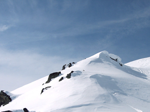
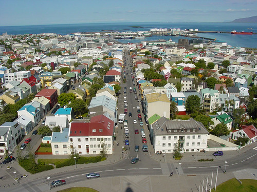
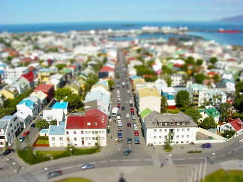
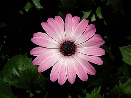
The photograph for today is another CC licensed photograph originally posted by flickr user listentoreason. Thanks Charles!

  1. Okay first, as always, open up your photograph in the Gimp and duplicate the background layer. Rename this layer Mask 1.
  2. Just like last time, we're going to decompose the image into LAB layers by clicking Image>Mode>Decompose.
    decompose_lab
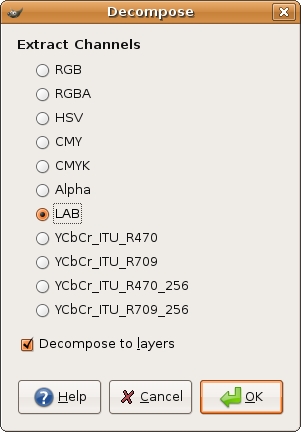
  3. Discard the A and B layers, then select all by pressing Ctrl-A and copy by pressing Ctrl-C.
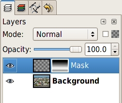
  4. Go back to your original color image, but this time, instead of creating a masking layer, we're going to use the quickmask by pressing Shift-Q. This will put a red overlay over the image. Press Ctrl-V to paste the copied Luminosity layer onto the quickmask and anchor the layer.
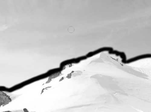
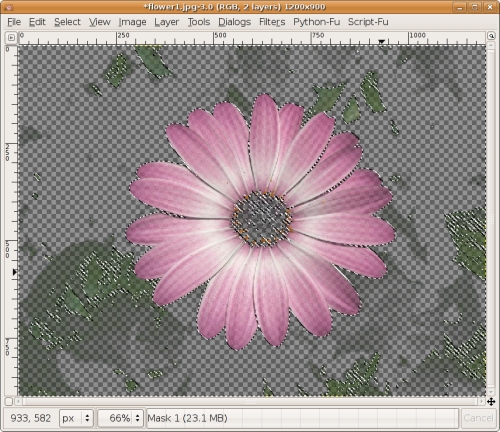
  5. Press Shift-Q again to toggle the quickmask off, and you should see the marching ants indicating a selection. If you look at the Selection Editor dialog, you'll see a black and white copy of your image that looks just like the Luminosity layer. White areas are fully selected, and black areas are fully deselected. So, right now, I've got almost all of the flower area selected along with some green leaves in the background.
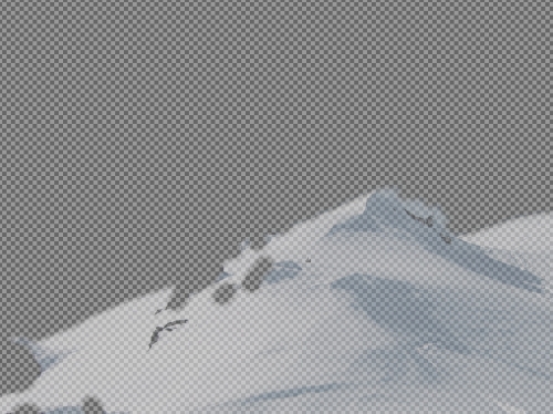
  6. Press Ctrl-I to invert the selection, then press Ctrl-K to delete everything in the selection. Here's what my Mask 1 layer looks like now:
    mask1
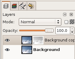
  7. Set Mask 1 layer blending mode to Multiply. The opacity is going to be subjective, so play around with yours, but I'm going to set mine to 57%.
  8. Now, Copy the background layer again, and merge the Mask 1 layer with the background copy and call it whatever you like. I'm calling it Layer 1.
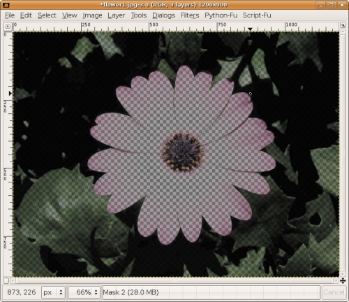
  9. Now, you should still have a selection. Activate the background layer press Ctrl-C to copy the selection. Create a new transparent layer on top of Layer 1 and call it Mask 2. Press Ctrl-V to paste into the layer and anchor it. Here's what my Mask 2 layer looks like:
    mask2
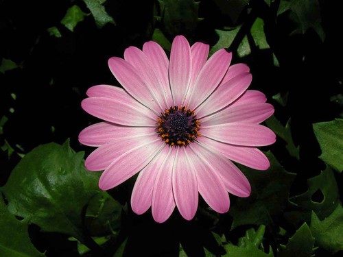
  10. Now, set Mask 2 layer mode to Screen. Wow! Hello leaves. Now, you could decide that you're done at this point, but you might want to play with the curves dialog a bit to bump up those highlights even more.
That's it! Here's the before and after:

Pink Flower Pink Flower Redux

I hope you've enjoyed this tutorial. Thanks for stopping by.

Friday, February 23, 2007

Luminosity Masking: The Light Side

11 comments

This is part one of a two part series on luminosity masking. The original Photoshop tutorial can be found on planetphotoshop.com and is entitled: Recovering Lost Highlight Detail, by Jim Patterson. Luminosity can be utilized for a great number of color and shade adjustments. Jim covers the basics, which should give you a good idea of the types of things you can do.

Okay, onward. The image for today is another CC licensed photograph found on flickr. It was originally posted by flickr user robad0b. Thanks! Please note that I don't actually think this photograph needs editing. I used it because it can highlight an extreme use of this technique. It is a very good photograph, and this technique is not going to make it better. It will however be good for illustrating the technique.

  1. Open your image, and make a copy of the background layer.
  2. Click Image>Mode>Decompose. Select the LAB radio button, make sure the Decompose to layers checkbox is checked and click OK.
    decompose_lab
    This will create a black and white copy of the photograph that probably looks pretty funky.
  3. In the layers dialog, you'll see 3 layers A, B and L. We only want the L (luminosity) layer, so you may discard the other two.
  4. Select the entire layer (Ctrl-A) and copy it (Ctrl-C).
  5. Go back to the original photograph. Right-click the background copy layer and select Add layer mask. Initialize it to white (full opacity) and click OK. Now, paste the copied luminosity layer from the decomposed version onto this mask (Ctrl-V). Anchor the layer by right-clicking the floating selection and selecting Anchor layer. You should now have a black and white thumbnail next to the color thumbnail in the background copy layer.
    layer_mask
  6. Now, we don't want to affect the sky with our luminosity adjustments, so we're going to mask it out by painting black over it on the mask. Right click the Background copy layer, and select Show layer mask. Use a soft brush, and carefully go over the edges of the sky with black.
    Now you can either continue using the paintbrush, or use the freehand select tool to select the rest of the sky and fill it in with black.
    edge_mask
  7. The mask is now prepared, so on your layers dialog, right click the Background copy layer and select Apply layer mask. Here is what my masked layer looks like.
    applied_mask
  8. Now for the adjustments. First thing, make sure Background copy layer is selected and change the layer mode to Multiply. Right away you will notice a big difference.
  9. The next few steps are really subjective. Here's what I'm going to do. First I'll reduce the opacity of the Background copy layer to around 50%. Then I went to Layer>Colors>Curves and bumped up the Value just a bit. Now, the rocks are too dark, so I'm going to erase the rocks from the Background copy layer using the eraser tool.

virgin_snow done
Now, you'll notice the area below and to the right of the rocks has a bit more detail, and the shadows are much more defined. I hope you've enjoyed this tutorial adaptation. Next time we'll finish up with The Dark Side.

Friday, February 16, 2007

Basic Photo Retouching

47 comments

Today I'm going to touch on some very simple yet extremely effective things you can do to make any photo look better. This is an adaptation of the Photo Edit 101 tutorial done by Worth1000.com user Dallas_TX.

You can use these basic guidelines to enhance just about any photo. In the future, I'll use this post as a reference on what to do before starting whatever it is I'll be writing about that day. So, anyway, let's get started. Pick an image you want to enhance and open it up. I'll be using another CC licensed image originally posted by flickr user Munzerr.

Castle BeforeCastle Final

Setting black and white points:
You will only need to do this step one time.

  1. Click Tools>Color Tools>Levels...
  2. In the levels dialog, click the Channels dropdown and select the Red channel.
  3. In the input levels, set the black level to 12 and the white level to 245.
  4. Do the same thing for the green and blue channels, but leave the Value channel alone.
  5. Click on the Save button, and save these settings. Now, whenever you want to apply these settings, you can just click the Open button and open this file you've just created.
Dallas gives a good explanation of why you would want to set the black and white points like that. I don't actually know if his explanation is correct or not, but it makes sense and the image certainly looks much better after applying the settings, so I'm not going to argue. Basically, what he's saying is that pure black and white don't actually contain any detail, so when you set the black and white points to almost black and almost white, you give the shades more detail. Like I said, I don't really understand the science of it, I just know it works.

More black and white settings

Now that we've told the program what our black and white limits are, let's pick out the darkest point and the lightest point in our image to define black and white for this picture.

  1. Click Layer>Colors>Threshold.
  2. Grab the left-hand slider, and slide it all the way left to 0.
  3. Slowly move the slider back to the right until some black spots start to appear. This is the darkest point on your picture. Remember this spot and click Cancel on the threshold dialog.
    black.point
  4. Open the Levels dialog back up and under the section for All channels, click the left-hand eyedropper and click in that darkest area of your picture.
    levels

Now, for the white point, you're going to do almost the exact same thing, except in the threshold dialog, after you drag the slider all the way to the left, you're going to manipulate the right-hand slider until things start to become visible. For me that was very quick. Remember that spot, cancel the threshold dialog. In the levels dialog, you're going to grab the right-hand eyedropper under the All channels section this time and click that whitest spot.

white.point

At this point, you should already be looking very much better.
beforeafter.colors
Now we're just going to push up the saturation ever so slightly. So click Layer>Colors>Hue-Saturation, and type some value between 5 and 15 into the saturation value. You will hardly notice a difference most likely, but it is there.

Now we're going to sharpen a bit. Click Filters>Enhance>Unsharp Mask. This is a very misleading title for a very useful tool. Use very small values here. If you go too high, you'll start seeing a glow appear around your dark objects. I used a radius of 1.5. For amount, I used .50. Leave threshold at 0.
unsharp
Play around with these values until you find something you like. Just remember, go easy. Lower values are better.

The next thing he mentions is straightening images. You can do this in images that have a horizon or other reference that should be horizontal. My image does not have that, so I'll just tell you how to do this in the GIMP. Pick out your reference, and drag a horizontal guide down until it touches the reference. Pick the rotate tool, and rotate the whole layer until the reference is parallel to the guide. Now, you'll notice the corners are transparent now. You'll just have to crop the image to remove the transparent areas.

Okay, that's it. Let's take a look at the before and after images.

beforeafter.sharp

Pretty sweet!

Thursday, February 15, 2007

Fake Tilt Shift

129 comments

Note there are several updates to this entry at the bottom.


Today's tutorial is an adaptation of Christopher Phin's Fake Model Photography tutorial for Photoshop CS, and it's all about faking tilt-shift photography.

Technicolor View redux

I'll be using another CC licensed photograph today. This one was originally posted by flickr user pietroizzo. Thank you very much!

Okay, let's get started.
  1. The most important part of this process is picking a good photo. There are basically 2 key components: aerial photography and strong lighting. You want this to look like you took the picture standing next to a model that's lit by a shop lamp.
  2. Open your photo and create a new transparent layer named Mask.
  3. Right click the new layer and select "Add layer mask"
  4. Reset your colors by pressing the [d] key. You should have black as foreground and white as background now.
  5. Grab the gradient tool, select the FG to BG (RGB) gradient, and set the shape to Bi-linear.
  6. Now pick out an imaginary focal point somewhere on your picture. When you take real closeup pictures of small objects with a nice camera, the focal point will be in sharp focus while the rest will be out of focus.
  7. Once you've got your focal point, click and drag the gradient in a vertical path starting from the focal point. It doesn't matter if it's perfect. This may take you a few tries to get just the way you want it. Note that you won't be able to see the gradient in your image, just in the mask thumbnail in the layers dialog.
    layer.mask
  8. Right click the Mask layer, and select "Mask to selection". Now you'll see some marching ants in a rectangle, but don't be deceived. The selection area indicated by the ants only indicates pixels that are more than 50% selected. If you take a look at the Selection Editor dialog, you'll see what the selection really looks like. (By the way, if anyone knows a better way to simulate Photoshop's quick mask, I'd love to hear it.)
  9. Activate the Background layer and click Filters>Blur>Gaussian blur. I used a 15 pixel radius, but you'll probably want to experiment with different levels of blur. Press [Ctrl]+[Shift]+[a] to deselect.
  10. Now for the color. Again, you'll probably want to experiment as the values in this step are highly subjective. Here's what I did: click Layer>Colors>Brightness-Contrast and bump the contrast up to 15. Then I bumped the color up a bit in the curves dialog (Layer>Colors>Curves).

Here's the before and after comparison:
Technicolor View

Technicolor View redux

That's pretty much it. I mentioned several times that you'll want to experiment, and I'll say it again. This isn't a formula so much as a guideline. The values for any of the above steps will need to be adjusted to taste for any photo, unless you pick this exact photo and you want it to look exactly like I made it look.

I hope you've enjoyed this tutorial adaptation. Thank you for following along.

Update: I realized after reading Alexanders comment that we could eliminate a couple of steps, so the article has been modified.

Update 2: Commenter Achim has pointed out the Focus Blur plugin made by Kyoichiro Suda. This really is a nice plugin, and I've been having fun with it today, but you must be using linux and you must have the libgimp2.0-dev package installed. For those reasons, I'm not going to include a tutorial for it because I think it's just too exclusionary. If you're savvy and you want a more powerful blur option, I highly recommend it.

Here's the same photo blurred with the Focus Blur plugin:

techni.rek.tsfb

Update 3: I was looking through the keyboard shortcut options and found the Quickmask! It's [Shift]+[Q]. There is also a tiny little button in the lower-left corner of the image window that toggles the quickmask. I may do some short tutorials on its use in the future.

Wednesday, February 14, 2007

In the process of moving...

8 comments

I'm in the process of moving my blog from wordpress to blogger. If you're looking for Gimparoo! content, please visit my old url for now: http://gimparoo.wordpress.com

Update: All the posts from my old blog have been moved to this page. If you'd like to see the comments from those posts, I encourage you to go visit the old url, but please remember to leave new comments here on blogger. Thank you!

I realize the template looks pretty sparse right now. I'll be working on that soon. I probably won't make any drastic changes except to widen the layout (does anyone really still use 800x600?) and maybe add a logo up top if I can come up with something. You may remember that I am completely not an artist, so that might be a challenge for me. Thank you for bearing with me during this transition. I promise to have new content soon!

Should I Include Inkscape?

5 comments

What I'm wondering is, should I include Inkscape as a tool for the tutorials on this blog? It's another open-source application which does vector paths a lot better than the GIMP's GFig plugin and I could make things like the Web 2.0 violators look a million times better. I'd still try to do everything here with the GIMP whenever possible, only using Inkscape when I felt it could accomplish the task in a way the GIMP could not.

I don't know how to do one of the fancy polls, so just post a comment with your opinion please. Thank you.

Update: It seems like the overwhelming majority would appreciate some Inkscape content. Havoc makes a very good point though. I'm a very busy guy. I'm a husband and a father. I have a full time job, and I am also taking a couple of courses at the local University. My time is Precious. However, one of the benifits of my job is that when things are going well, I can pretty much research and do what I please. I'm not terribly familiar with Inkscape, but since people (including myself) feel that it is a valuable addition, I will make an effort to include it when appropriate. After all, one of the reasons I started this project is to learn new things. So far, there's really only been one post where it would have made a difference in my opinion, so there may not be much call for it.

Thank you everyone. I really appreciate the input.

Tuesday, February 13, 2007

Orton Effect

44 comments

For today's adaptation, I'm not going to single out any one particular tutorial because there are many good ones, and they're all a bit different. If you want the Photoshop method, I advise you to do what I did, and google it.

So, here we go.

Sunday, February 11, 2007

Lomography

3 comments

Today I'm going to give you another simple but effective technique. We're going to simulate lomography with a few simple steps. The original Photoshop tutorial I'm adapting was done by Denny Tang and can be found here. We'll be using another CC licensed photograph originally posted to flickr by user Bob Jones. Many thanks to Mr. Jones.

So, here we go.

Saturday, February 10, 2007

Contrast Masking

1 comments

Last time I said I'd get into something a little more in depth, but I couldn't resist posting this simple technique. It's so easy and so amazing, I think you will love it. I found the original tutorial on nyfalls.com. I don't know if "masking" is really the proper term for what we're about to do, but I don't have a better one, so that's what we'll call it.

Let's get started.

Friday, February 9, 2007

Selective Colorization

1 comments

Today, I'm going to teach you how to first simply create a black and white image from a color photo, then to selectively colorize any portion of the photo. I'm not going to directly adapt a Photoshop tutorial because this is a very simple process, but if you want to find the Photoshop way of doing this, simply google "selective colorization" and you'll get about five gazillion results. For those of you keeping track, yes, this is the first Gimparoo original.

So, as I mentioned in the previous post, flickr's CC license image search tool is totally awesome, and that's where I found today's image. In the spirit of the license, I'm attributing flickr user Daniel Montesinos as the original photographer. Thank you Daniel. I will also make my finished product available with the same license provisions on my flickr page.

On with the show!

Wednesday, February 7, 2007

Adapting Web 2.0 Design: Part 2

1 comments

Last time we adapted the first part of Tommy Maloney's Web 2.0 Design Kit, and today we're continuing with the second half. The original adaptation can be found here: Web 2.0 Design Kit, Part 2. I found what I believe to be a mistake in the original diagonal line tutorial. He says to make a 7x7 pixel selection but I could not get the diagonal lines to line up like that. I even tried it out in Photoshop just to make sure it wasn't something to do with the application, but still couldn't get it to line up properly. I ended up modifying my instructions so that they work. If anyone knows what I'm doing wrong, I'd love to know. Anyway, on with the tutorial!

Monday, February 5, 2007

Adapting Web 2.0 Design

4 comments

Today I'm going to be adapting a tutorial that was one of the first Web 2.0 tutorials I ever saw, and is kind of the inspiration for this site. It's by a guy named Tommy Maloney who writes for a website called Photoshop Lab. The tutorial in question is his Web 2.0 Design Kit. We'll cover part 1 today, and maybe go over part 2 another day. Since we covered violators last time, I'm not going to go over that part again. We're just going to recreate the header logo. So fire up GIMP, and follow along!

The Background


  1. In the document you want to create the logo in, create a rectangular selection the size you want the logo to be. Create a new layer and call it "Gradient".

  2. GIMP doesn't actually let you edit their default gradients, so we are going to create a new gradient. In the Gradient selection dialog, click the "New gradient" button.
    gradient.selector.new

  3. In the Gradient Editor dialog, give the gradient a cool name, then right click the gradient and select "Split segments at midpoints. Along the bottom bar, you should see 3 black and 2 white triangles. Double click the left-hand white triangle. Right click this area and select "Left Endpoint's Color" and set it to #484848. Right click again and select "Right Endpoint's Color" and set it to #575757. Double click the right-hand midpoint triangle and set it's left color to #5e5e5e and the right to #707070. Click the save button and close the editor dialog.
    gradient.editor.2

  4. Making sure the Gradient layer is selected, press and hold Ctrl to constrain your movements, click and drag from the bottom of the selection to the top and release. The gradient is now applied.
    gradient.applied

  5. Create a new layer called "Color" and place it above "Gradient" in the layers stack. Fill it with whatever color you want, and set the layer mode to something that looks good to you. I used Overlay. This technique is neat because if you ever want to change the colors of your website, you can just come back to this image, select the "Color" layer, click Layer>Colors>Hue-Saturation..., and change to any color you want without affecting the gradient or any of the other elements. Neat!
    overlay


Reflected Text


This is a really cool effect that is very simple to do when you know how. Here's how to do it with GIMP.

  1. Select the text tool, set the color to white and set your font size and type options (don't worry, you can change all of this later if you want,) and type the text you want to see. Use the arrow keys to manuever the text into position just above the break in the gradient.

  2. Duplicate the text layer and name it "Reflection". Click Layer>Transform>Flip Vertically. Use the arrow keys to manuever the flipped text till it's just below the original text. They should touch, so there is no gap between them.

  3. Right-click the Reflection layer and select "Add layer mask..." Initialize it to White (full opacity) and click OK. Select the gradient tool, set it to FG to Transparency, check the Reverse checkbox, and set the foreground color to black. Drag the gradient from top to bottom. Continue playing with this until you get it the way you like it.
    reflectext


Soft Shadow


The final touch is the soft shadow underneath the logo. This is probably the easiest part for us.

  1. Activate the Color layer in the stack, and with the "Select contiguous region" tool, select the colored area. Click Select>Feather... and set the feather to 15 and click ok.

  2. Create a new layer below the "Gradient" layer called "Shadow" and set it's opacity to 50. Make sure black is the foreground color, and fill the selection.
    shadow


That's it! I hope you've enjoyed this P2G tutorial. The comment board is open, so drop me a note. Thanks!

Saturday, February 3, 2007

Web 2.0 Violators

5 comments

Please note, there is now an Inkscape version of this tutorial available.


For this tutorial, I'm going to adapt Ajax Lessons: Web 2.0 Badge Photoshop Tutorial.

  1. Open a new file, 200px by 200px with a white background layer.

  2. Open the GFig dialog by clicking Filter>Render>GFig...

  3. Select the "Create star" tool, set the number of sides to 12, uncheck the "Stroke" checkbox, select "Color Fill" from the drop-down menu and select white for your color from the color picker.
    gfig1

  4. In the drawing area of the GFig window, starting at the center, click and drag to the outside creating a star shape that almost fills the window. Leave some room on the outside for the border and drop shadow later.