Showing posts with label gimparoo. Show all posts

Thursday, February 22, 2007

Excuses excuses...

3 comments

I have a couple of tutorials simmering, but I just can't dedicate the time they need right now. I've got two tests, today and tomorrow, and I need to focus. I promise this weekend I will have some content for you. Thanks for being patient.

Tuesday, February 20, 2007

Borked my partition

6 comments

Hey everyone. I thought I'd be cute and use a rearrange my partitions to give me more space for my linux partition, and I managed to completely kill my system. So, I'm spending the day recovering my files, reinstalling my OS and all my applications. Once I've got everything in place, I'll finish up the next tutorial and post it, but that might not be until tomorrow or the next day depending on how much free time I get.

I'll also probably be changing the layout here to try to pretend that I'm an actual website instead of a blog. My plan is to just make some backdated posts and then put links to them in the sidebar. Who knows, maybe one of these days Gimparoo will move to a commercial host. Maybe.

Anyway, just wanted to give you all a heads-up. If you're looking for some Gimp related fun, you might check out the Gimp User Group (GUG). I've known about it for a long time, but just signed up as a member.

Monday, February 19, 2007

Inkscape: Web 2.0 Violator

29 comments

My very first tutorial was an adaptation of a Photoshop tutorial on how to make one of those trendy violator badges. Well it turned out pretty ugly looking because the GFig plugin for the GIMP doesn't anti-alias the lines. Much discussion was had on whether or not I should include Inkscape tutorials on this blog to make up for the shortcomings of the GIMP, and I decided that I would give it a shot.

Now, before I start, keep in mind that I am a total newbie at Inkscape, so there is probably an easier way to do the things I'm about to show you. By all means, please suggest improvements on the way I've done things here. Okay, enough weasling, on with the tutorial.
ink.violator


  1. Open up Inkscape and set your document size to 200x200px. Set the X and Y grid spacing to 5px and make sure you've got grid snapping on. Press [5] to make the document fit the window size.

  2. Click the stars and polygons button (or press [*]). Increase the number of corners to 12, and make sure the Polygon checkbox is unchecked. Set the spoke ratio to 0.830 and make sure Rounded and Randomized are set to 0.

  3. star.props
  4. Starting in the center of the drawing area, click and drag out to the 10px mark.

  5. first.star
  6. Click Edit>Duplicate. You won't see a change, but you've actually got 2 shapes now. One on top of the other. Select the top shape and change it to whatever color you want your violator to be.

  7. With the selection tool [F1] press and hold the [Alt] button and click the star shape. This will actually select the one on the bottom. You can tell because the color in the lower left will switch to black.

  8. Click Object>Fill and stroke. Set the Blur to 3.5 and the Master opacity to 80.0%.

  9. fill.stroke.1
  10. Now select the colored shape and duplicate it again. Now, if you still have the fill and stroke dialog box open, change the color to white and click the radial gradient box.

  11. radial.fill
  12. Now select the gradient tool [Ctrl]+[F1], and you'll see 3 handles that form a right angle in the center of the gradient. These control the position and size of the gradient. Grab the middle one and drag it to the upper-left portion of the shape. You can play with the other 2 handles to resize the gradient. I left it as-is.

  13. Now select the text tool [F8] and click anywhere in the shape to start typing.

  14. Using the selection tool, click twice until you see the handles on the corners change to indicate that it's in rotation mode and rotate the text however you want it. Note: You can create a shadow under the text the same way you did with the shadow for the shape.

ink.violator
That's it! Once you get the hang of how inkscape works, it really is easier to use for this sort of thing than the GIMP. I hope you've enjoyed this tutorial. Thanks for following along.

Friday, February 16, 2007

Basic Photo Retouching

47 comments

Today I'm going to touch on some very simple yet extremely effective things you can do to make any photo look better. This is an adaptation of the Photo Edit 101 tutorial done by Worth1000.com user Dallas_TX.

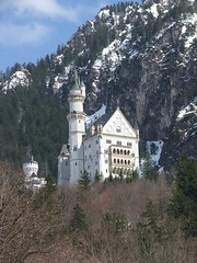
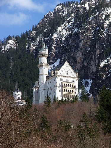
You can use these basic guidelines to enhance just about any photo. In the future, I'll use this post as a reference on what to do before starting whatever it is I'll be writing about that day. So, anyway, let's get started. Pick an image you want to enhance and open it up. I'll be using another CC licensed image originally posted by flickr user Munzerr.

Castle BeforeCastle Final

Setting black and white points:
You will only need to do this step one time.

  1. Click Tools>Color Tools>Levels...
  2. In the levels dialog, click the Channels dropdown and select the Red channel.
  3. In the input levels, set the black level to 12 and the white level to 245.
  4. Do the same thing for the green and blue channels, but leave the Value channel alone.
  5. Click on the Save button, and save these settings. Now, whenever you want to apply these settings, you can just click the Open button and open this file you've just created.
Dallas gives a good explanation of why you would want to set the black and white points like that. I don't actually know if his explanation is correct or not, but it makes sense and the image certainly looks much better after applying the settings, so I'm not going to argue. Basically, what he's saying is that pure black and white don't actually contain any detail, so when you set the black and white points to almost black and almost white, you give the shades more detail. Like I said, I don't really understand the science of it, I just know it works.

More black and white settings

Now that we've told the program what our black and white limits are, let's pick out the darkest point and the lightest point in our image to define black and white for this picture.

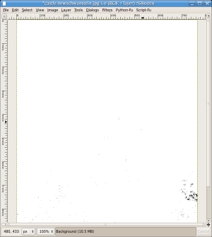
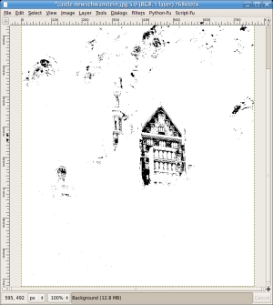
  1. Click Layer>Colors>Threshold.
  2. Grab the left-hand slider, and slide it all the way left to 0.
  3. Slowly move the slider back to the right until some black spots start to appear. This is the darkest point on your picture. Remember this spot and click Cancel on the threshold dialog.
    black.point
  4. Open the Levels dialog back up and under the section for All channels, click the left-hand eyedropper and click in that darkest area of your picture.
    levels

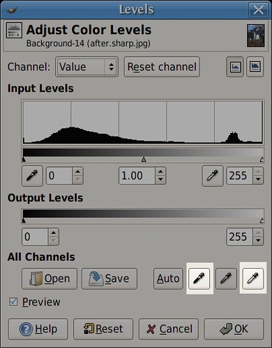
Now, for the white point, you're going to do almost the exact same thing, except in the threshold dialog, after you drag the slider all the way to the left, you're going to manipulate the right-hand slider until things start to become visible. For me that was very quick. Remember that spot, cancel the threshold dialog. In the levels dialog, you're going to grab the right-hand eyedropper under the All channels section this time and click that whitest spot.

white.point

At this point, you should already be looking very much better.
beforeafter.colors
Now we're just going to push up the saturation ever so slightly. So click Layer>Colors>Hue-Saturation, and type some value between 5 and 15 into the saturation value. You will hardly notice a difference most likely, but it is there.

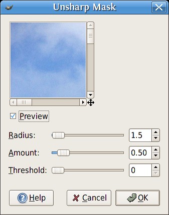
Now we're going to sharpen a bit. Click Filters>Enhance>Unsharp Mask. This is a very misleading title for a very useful tool. Use very small values here. If you go too high, you'll start seeing a glow appear around your dark objects. I used a radius of 1.5. For amount, I used .50. Leave threshold at 0.
unsharp
Play around with these values until you find something you like. Just remember, go easy. Lower values are better.

The next thing he mentions is straightening images. You can do this in images that have a horizon or other reference that should be horizontal. My image does not have that, so I'll just tell you how to do this in the GIMP. Pick out your reference, and drag a horizontal guide down until it touches the reference. Pick the rotate tool, and rotate the whole layer until the reference is parallel to the guide. Now, you'll notice the corners are transparent now. You'll just have to crop the image to remove the transparent areas.

Okay, that's it. Let's take a look at the before and after images.

beforeafter.sharp

Pretty sweet!

Thursday, February 15, 2007

Post Coming Soon

2 comments

I know you are all probably ready for some new content by now, so I just wanted to let you know that I have a post cooking, I just haven't been able to perfect it yet. I've got to do some homework tonight, but I'll try to have it up in the next 24 hours.

Hang tight!

Wednesday, February 14, 2007

In the process of moving...

8 comments

I'm in the process of moving my blog from wordpress to blogger. If you're looking for Gimparoo! content, please visit my old url for now: http://gimparoo.wordpress.com

Update: All the posts from my old blog have been moved to this page. If you'd like to see the comments from those posts, I encourage you to go visit the old url, but please remember to leave new comments here on blogger. Thank you!

I realize the template looks pretty sparse right now. I'll be working on that soon. I probably won't make any drastic changes except to widen the layout (does anyone really still use 800x600?) and maybe add a logo up top if I can come up with something. You may remember that I am completely not an artist, so that might be a challenge for me. Thank you for bearing with me during this transition. I promise to have new content soon!

Should I Include Inkscape?

5 comments

What I'm wondering is, should I include Inkscape as a tool for the tutorials on this blog? It's another open-source application which does vector paths a lot better than the GIMP's GFig plugin and I could make things like the Web 2.0 violators look a million times better. I'd still try to do everything here with the GIMP whenever possible, only using Inkscape when I felt it could accomplish the task in a way the GIMP could not.

I don't know how to do one of the fancy polls, so just post a comment with your opinion please. Thank you.

Update: It seems like the overwhelming majority would appreciate some Inkscape content. Havoc makes a very good point though. I'm a very busy guy. I'm a husband and a father. I have a full time job, and I am also taking a couple of courses at the local University. My time is Precious. However, one of the benifits of my job is that when things are going well, I can pretty much research and do what I please. I'm not terribly familiar with Inkscape, but since people (including myself) feel that it is a valuable addition, I will make an effort to include it when appropriate. After all, one of the reasons I started this project is to learn new things. So far, there's really only been one post where it would have made a difference in my opinion, so there may not be much call for it.

Thank you everyone. I really appreciate the input.

Tuesday, February 13, 2007

Hello New Visitors

2 comments

Holy moly. I checked my blog stats on a whim, and for a minute, I thought maybe I had somehow logged in as someone else. Right now I'm sitting at 1,801 hits, and at this rate, it looks like we'll hit 2,000 before the day is done. (My previous high was 39. As in, less than 40.) I believe I have Ubuntu Blog and Planet Ubuntu to thank, so, thanks!

I hope you are all finding something useful. Keep in mind I just started this blog recently, so after a while there will be a lot more material. I would love it if you would recommend some tutorials you'd like to see adapted. It's helpful to know what people are looking for. Before today, my most popular posts were the ones regarding Web 2.0, but now it seems most are checking the Lomography adaptation out.

I seriously almost cried when I opened up google reader and saw my blogs' name right up on top. I even took a screenshot.
gimparoo.screen

Thanks again for visiting. I hope you'll stick around. I should have some new content for you very soon!

Update: Just cracked 2,000 visitors. Thanks everyone, you're seriously making my day.

Friday, February 9, 2007

Selective Colorization

1 comments

Today, I'm going to teach you how to first simply create a black and white image from a color photo, then to selectively colorize any portion of the photo. I'm not going to directly adapt a Photoshop tutorial because this is a very simple process, but if you want to find the Photoshop way of doing this, simply google "selective colorization" and you'll get about five gazillion results. For those of you keeping track, yes, this is the first Gimparoo original.

So, as I mentioned in the previous post, flickr's CC license image search tool is totally awesome, and that's where I found today's image. In the spirit of the license, I'm attributing flickr user Daniel Montesinos as the original photographer. Thank you Daniel. I will also make my finished product available with the same license provisions on my flickr page.

On with the show!

Wednesday, February 7, 2007

Busy, busy, busy

1 comments

I've got a lot going on right now, but I wanted to let everyone know that there are more Photoshop adaptations in the works for you. I'll probably put up new content this weekend. We'll move away from this web 2.0 business and delve into the real meat and potatoes: photo retouching. Stay tuned, and we'll hopefully be able to help some of you photog's out there save a bit of cash and maybe learn a few things.

Friday, February 2, 2007

Hello GIMP Users!

1 comments

As it says in my info page, I'll be using this space to adapt existing popular Photoshop tutorials into GIMP tutorials. I will attempt to obtain permission from original tutors when necessary, and will at least always attribute the original work, so if you'd like to see something done the Photoshop way, you can simply follow the attribution links to the original work.

At some point, I plan on actually being more proficient with GIMP and will be authoring original Gimparoo tutorials. If you ever see the "Gimparoo" category attached to a post and no attribution links, this means I have succeeded.

For those of you wondering what the heck GIMP is; GIMP stands for "GNU Image Manipulation Program". It is a program similar to but not exactly like Adobe's popular Photoshop application. The most significant difference to the lay user is that GIMP is free. I say "lay user" because Photoshop does have significant advantages for the professional user, but to the average user, GIMP is more than sufficient. Especially for free. You can download GIMP and a large number of add-ons for Windows, Macintosh or Linux by visiting their website. If you are running some modern flavor of Linux, chances are good that you already have it installed. Being open source software, there are a number of ways you can personally contribute to the project. Please explore the GIMP homepage and it's associated links for more information.

So, on with the show already! Up next I'll start with everyone's favorite new fad: Web 2.0. I'll be walking you through a few of the more popular Web 2.0 Photoshop tutorials, GIMP style, and hopefully we'll all learn something in the process.